The Job Card

ZipRecruiter
•
2024
For job seekers, the job card is a key element in the ZipRecruiter interface, but functionally, it presented several issues; it was difficult to read, reuse, and test. I led the effort to improve the job card from usability and system perspectives.
Lead Product Designer
System Design
UI Design
Problem
The job card had glaring usability issues and needed to be rebuilt for each new placement, an inefficiency we hoped to correct. Could we redesign the job card to not only improve usability, but also promote consistency and enable powerful testing?

While this doesn't look terrible, it's uncommon for a job to have clean and complete data.

A more realistic job.
We had spent years tolerating the suboptimal design and were ready for a change. There was a laundry list of usability and visual issues that needed to be addressed;

Research
Several of the issues stated above were based on my intuition and understanding of best practices, but others came directly from our research. Job seekers who reported jobs cited a lack of information as a top reason.
After digging in with user interviews, Ben, our research lead, learned that job seekers were frustrated by cut off job titles and locations. They loved our 1-Tap Apply feature, but felt some jobs didn’t have enough substance for them to confidently use it. This was especially true for job seekers in trucking and healthcare, as hiring managers in those industries tended to stuff job titles with keywords.
Our Vision
We aimed to improve the job card's usability upfront and systemize the design for added testing capabilities. We also hoped to use the project as a starting point for improving our process of implementing reusable components across our product ecosystem.
Features
Vertically Spaced & Dynamic Elements
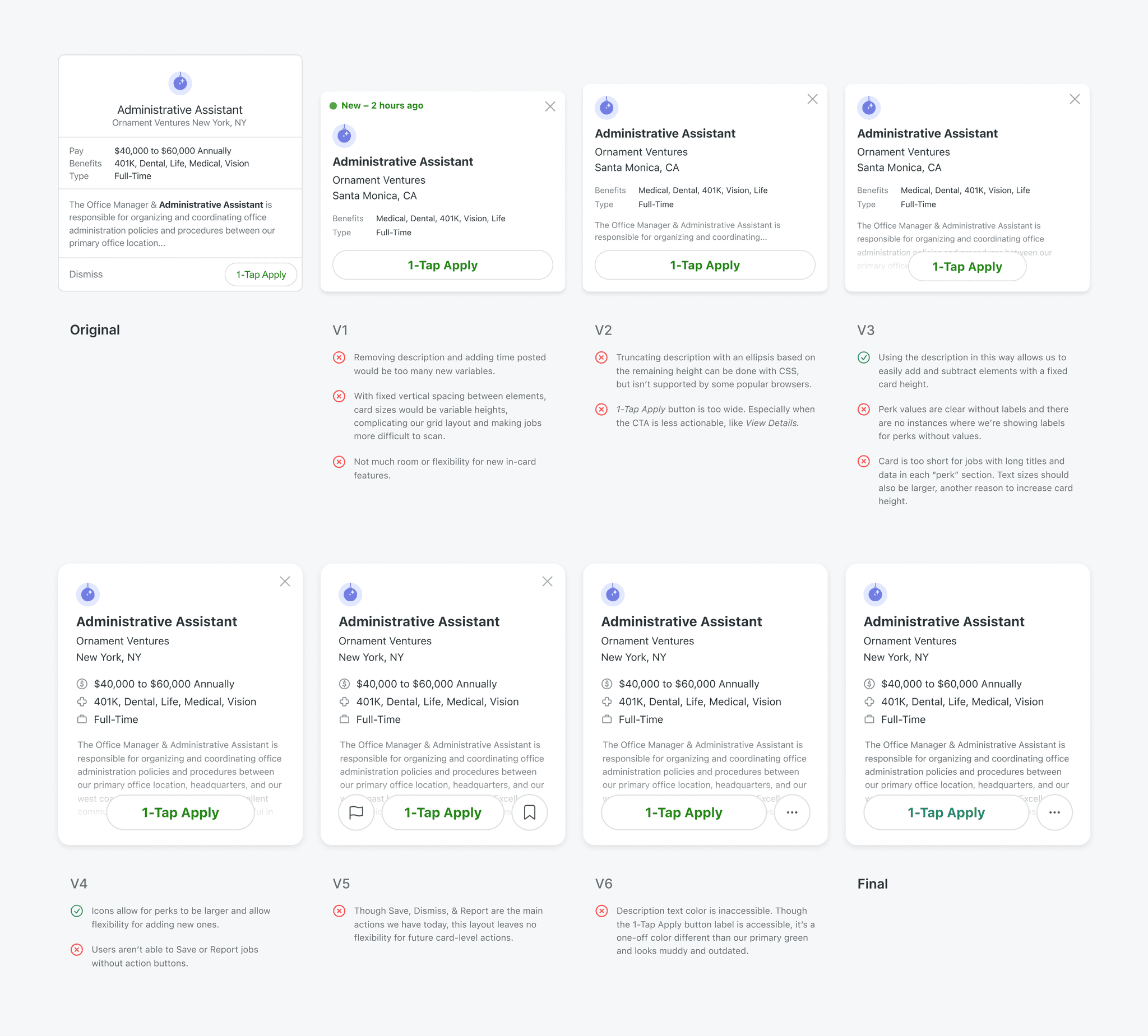
Because our job data can be very inconsistent, I designed the job card as it’s own mini system, giving internal elements their own full-width vertical space. This allowed each element to dynamically grow or hide depending on its contents and the data available to us. It also gave us the flexibility to easily add, reorder, or remove internal elements in future tests.

Improved Readibility
The flexible system allowed us to show full job titles and company names by wrapping longer strings. I aligned every element to the left for faster scanning and set a clear typographic hierarchy by tweaking font sizes and weights for added emphasis on the job’s most important details.
Job Card Action Menu
Performing actions from the job card had previously been inconsistent. Some cards allowed users to save and report jobs, while others only allowed for the dismissal of jobs. I tucked all actions into an expandable menu, giving users access to the same actions from every placement. Further, this solution was fluid enough to accommodate new actions later on if we needed them.

Accessibility
Updated our grey text values to comply with the WCAG color contrast guidelines. This prompted a wider color audit and later, a dramatic change to our color palette, including our primary brand green.
Exploration
I started explorations by critically thinking about the types of information that are important to our users, but was met with resistance because of time and engineering constraints. I pivoted to restructuring the information that was already there in a way that would enable us to easily test contents later.
Implimentation
Working with front-end to implement the new job card exposed holes in our outdated design system process. Because of our product organization’s habit of moving quickly and A/B testing everything, many front-end engineers avoided spending the time to create and document a component before it actually proved successful. This was reasonable, but added to ZipRecruiter’s technical debt. Once a test variant won, we resolved to it quickly and moved on.
I organized meetings with front-end and design stakeholders to figure out how we could combat this issue. We decided to build in time to componentize winning variants and formed a team to take a more wholistic approach to improving our design system workflow. I could speak more to how we’re approaching our design system, but I’ll save that for another time.
With a temporary solution in place, I documented the new job card system and helped stress test the component before finally testing it with job seekers.

Results
We tested the new card design on the Suggested Jobs page first and planned to roll it out to other placements with a win. The A/B test revealed that the new card design significantly outperformed the old with a 10% lift in clicks and a 6% lift in applications, a substantial win for what was on the surface, a simple visual UI update.
Based on the agreement we made with front-end, the card was componentized and extended to its different placements. It performed similarly in its other placements and even better on iOS and Android, lifting applications by 7% and 8%, respectively.
Other projects